FABRIANO® - Tiziano pastel paper - Prato
It’s been a few months now since I bought Fabriano Tiziano pastel paper: a sheet measuring 70 by 100 centimetres that was sent flat rather than rolled up in a tube. It was a huge box and the postman could only just manage to slide it inside (the hallway wasn’t any longer than the package, but thank you for the free cardboard!).
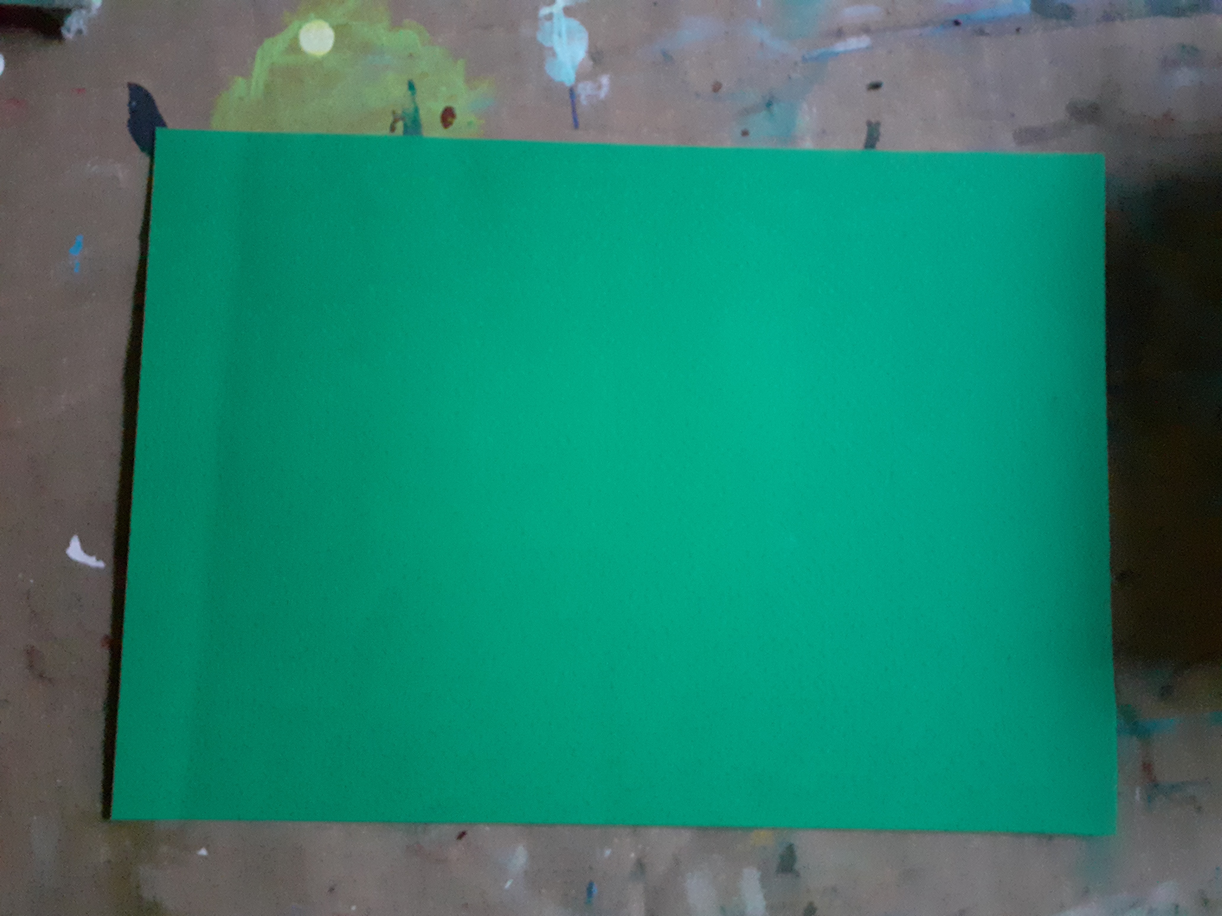
This paper is available in various colours and I chose a green (Prato). The paper is said to contain 40% cotton and weighs 160 grams.
As the sheet was creased, I decided to cut it into smaller pieces, and as I’m not very good at cutting straight, I also used a paper cutter.
Minus: I find the creases in the paper annoying, and they can’t be smoothed out with or covered by the chalk.
The texture of the paper isn’t particularly pronounced either. The chalk doesn’t absorb into it, so I constantly have to brush the chalk off the paper, which is a bit of a nuisance. I also can’t apply nearly as many layers of chalk as I can on the much cheaper Bamboo paper (available at Action), even though that paper isn’t coloured it is a better choice if it comes to me.
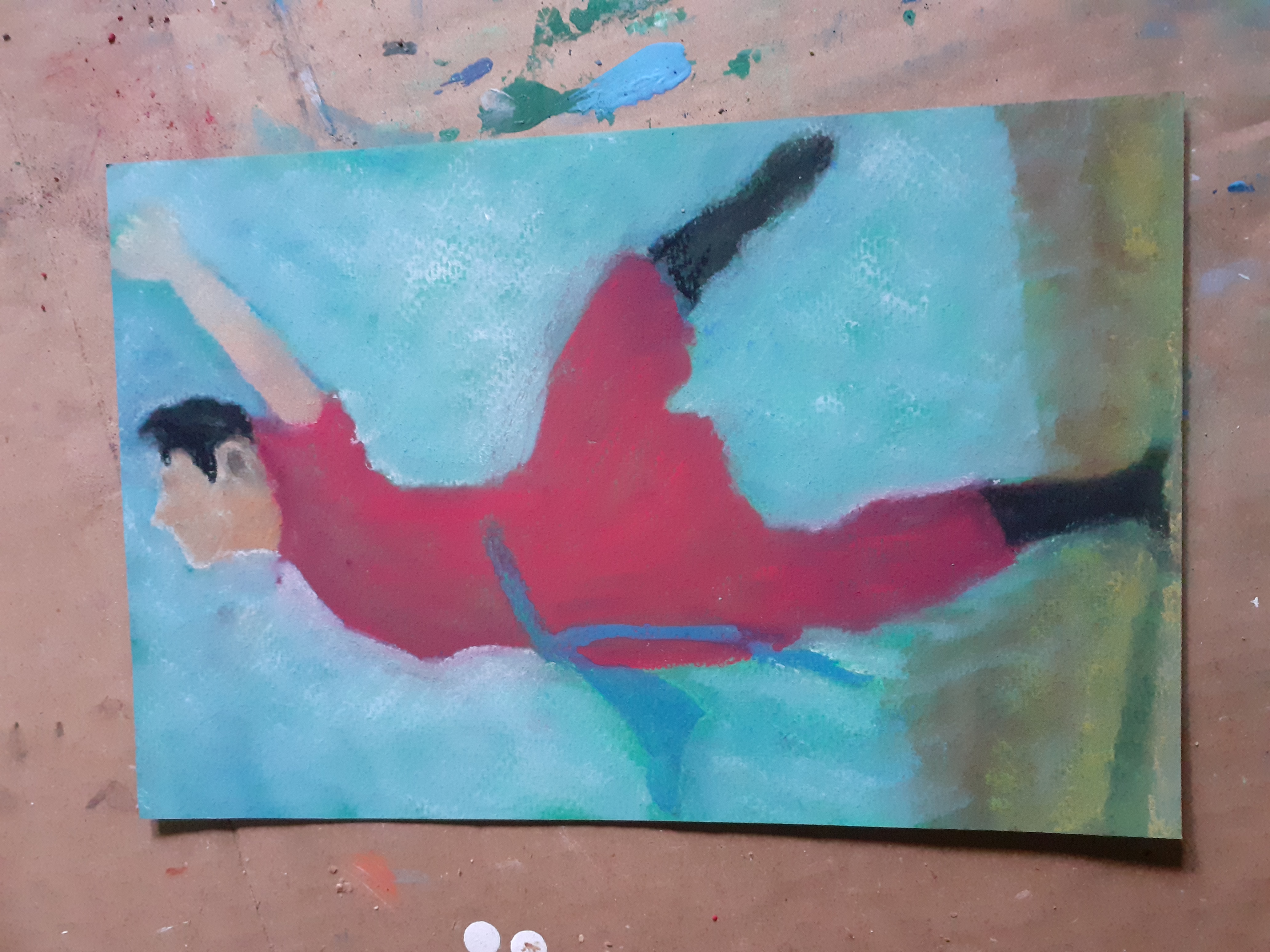
Bruynzeel: And then there are the pastel pencils. An expensive box. I tried them out on this paper straight away. Sketching works fine, but once you’ve painted with Rembrandt soft pastels, you can’t add anything else with these pencils. I find this a major drawback (although you can, of course, add details with chalk as well, provided the chalk cooperates).
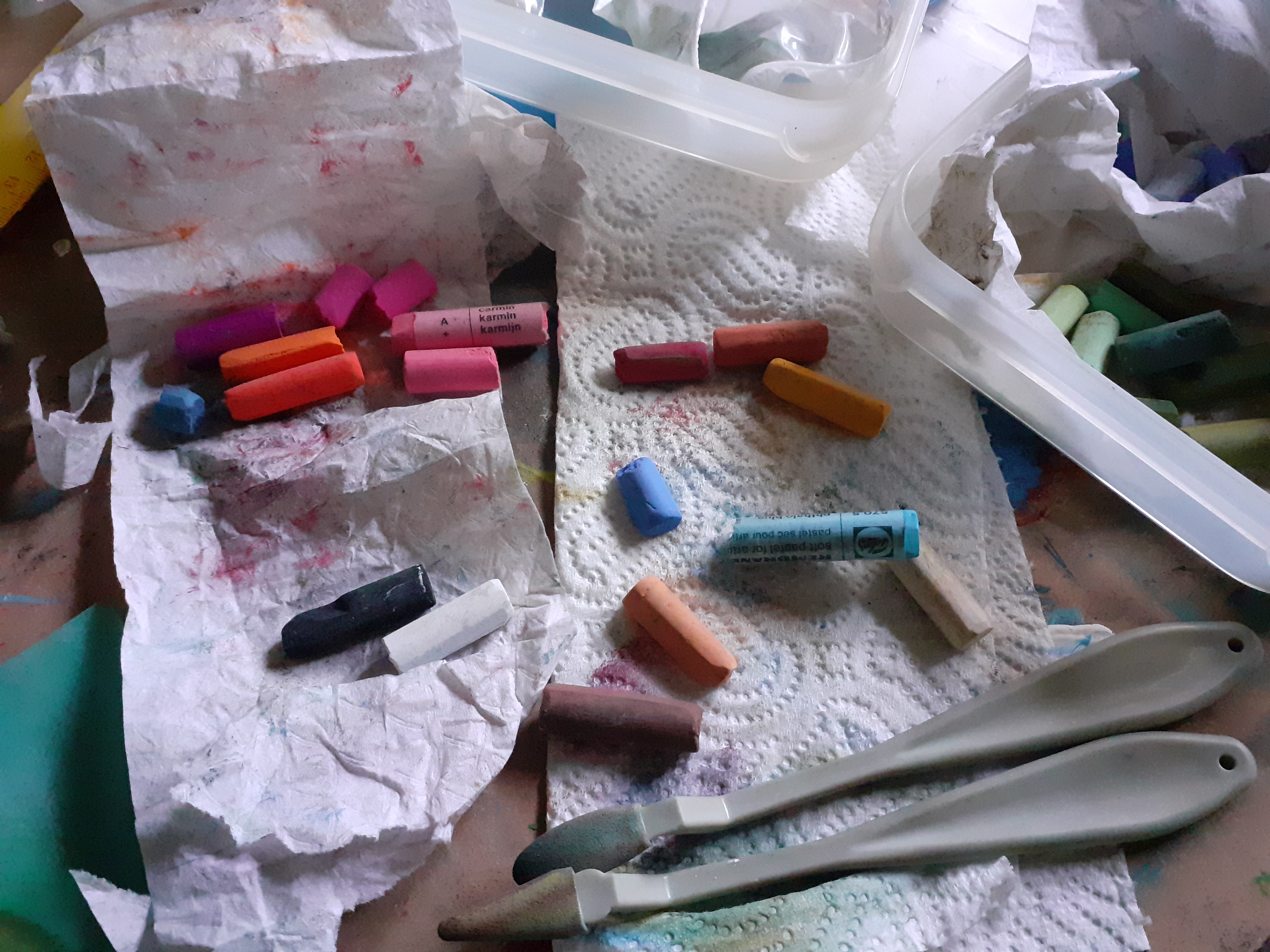
As I travel a lot, I’ve split the Rembrandt pastel chalk in two. I keep it here in a small meat plastic box. The gloves and a few other essentials fit in here nicely too.
Yesterday I tried my hand at a still life, two pears, also on that green paper. If you look closely, you can see that the paper is still visible even after at least four layers, and don’t even ask how much chalk I had to knock off. I’m going to see if I can manage with much less chalk, as this feels a bit like a waste. Perhaps this paper is best suited to those who work exclusively with pastel pencils.
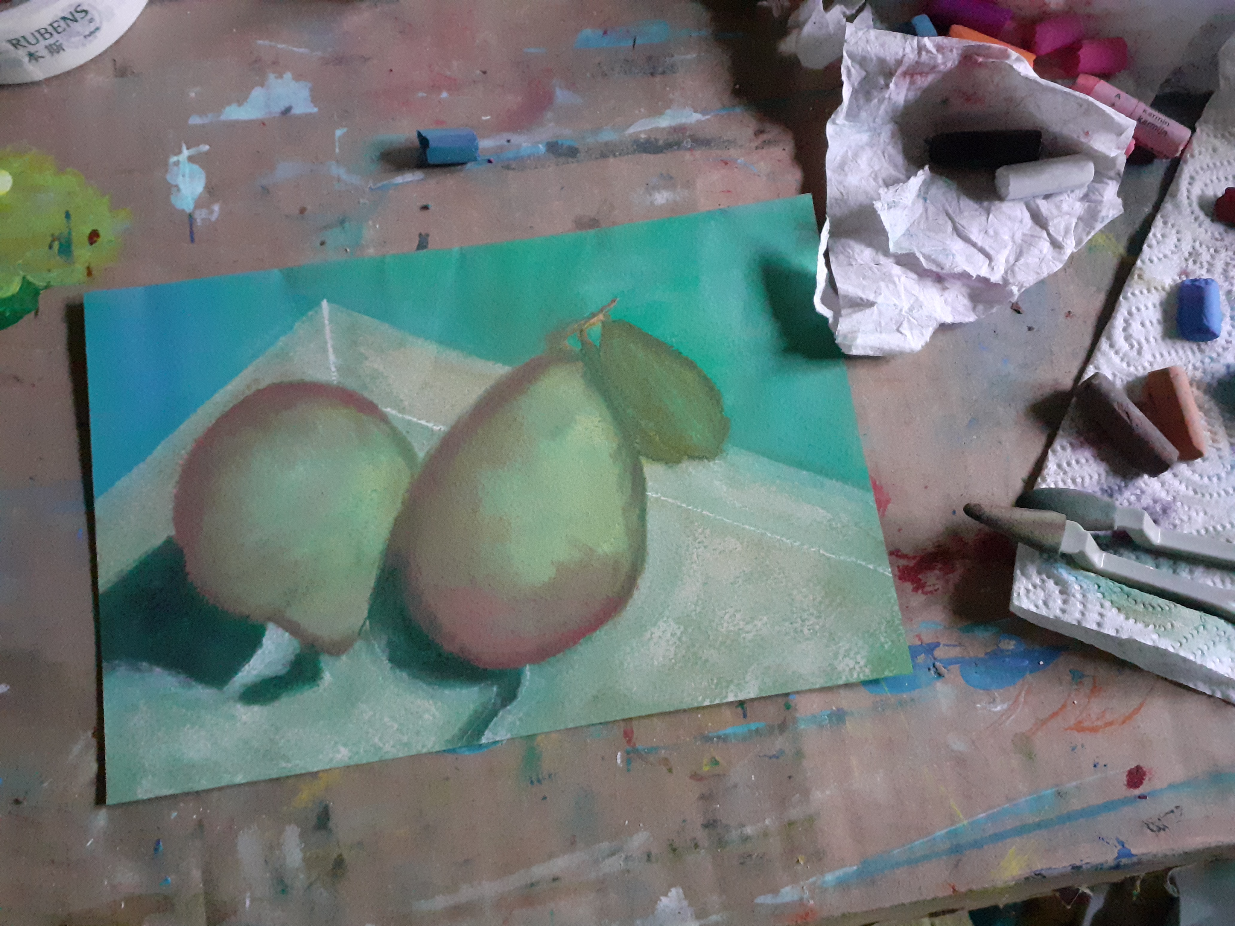
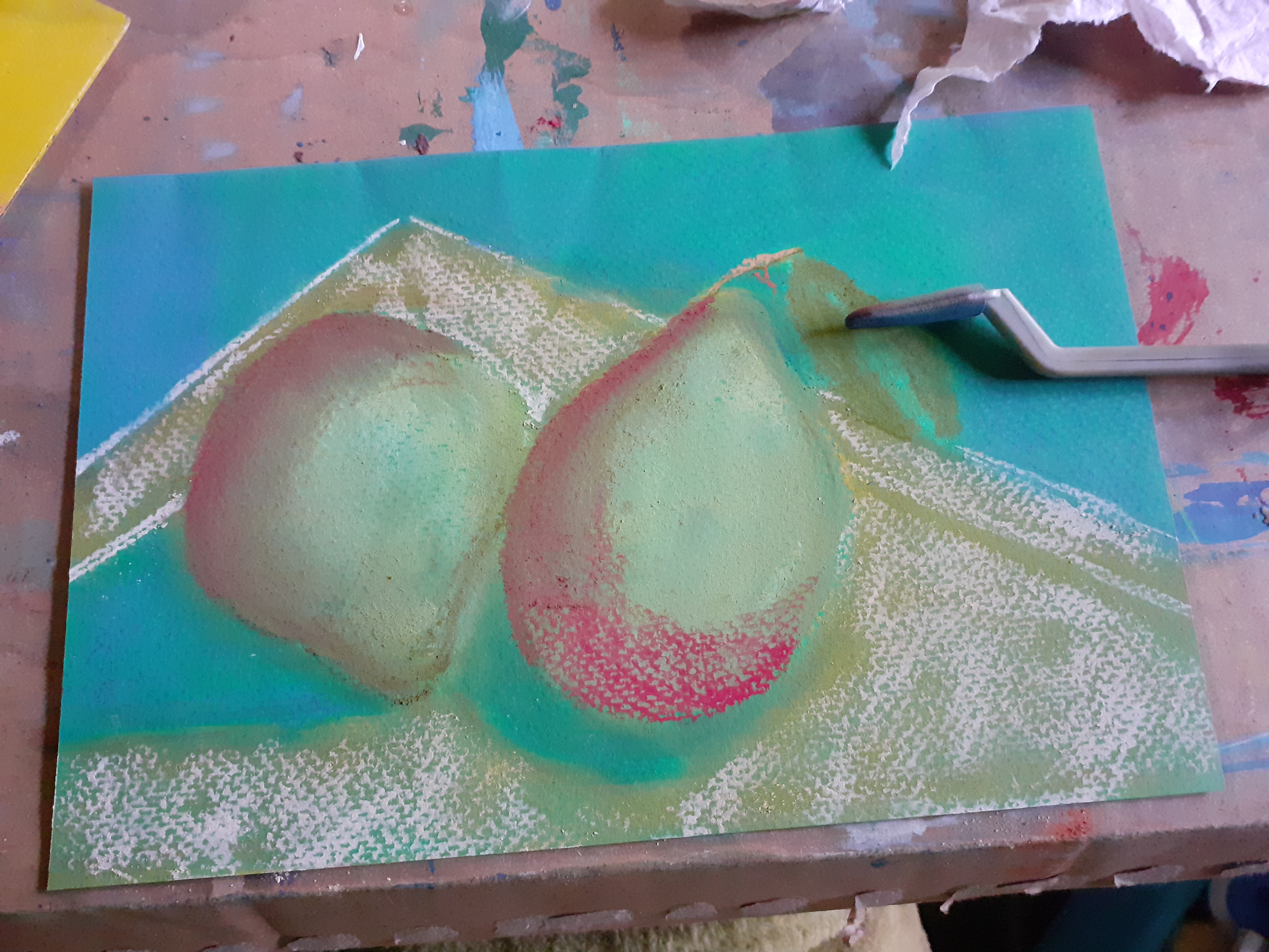
Btw, That still life isn’t finished yet and I can’t tell you which colours I used either, because the labels have been removed from the crayons. In any case, I needed a lot of white and didn’t need any green paper to paint this at all. Incidentally, the green I received is also a completely different shade to the one listed on the Gerstaecker website.
27-4-2026
The wrinkles on such a large sheet are a serious problem, it is completely understandable that this spoils the whole experience from the very beginning. And as for the difference in color, this is also quite annoying, especially when you rely on a specific tone for your composition. I would be interested to hear if you will find a more suitable application for it over time or if you will give it up completely :)
You like the color green, it's a constant in your paintings. My favorite color is blue.
I can finally look at photographs. I have trouble understanding images in texts almost every day.
The lack of visual elements makes it significantly more difficult to understand the text, especially when they play a significant role in the content.
Although the still lifes are still a work in progress, the pears already look absolutely stunning! I'm not an artist, but I can imagine how much patience and effort it takes to draw something like this with chalk.
I also really like the color green. It's a shame you can't smooth out the wrinkles in the paper. Apparently, the cotton fiber in the composition makes the paper heat-resistant.