FABRIANO® - Tiziano pastel paper - Prato
It’s been a few months now since I bought Fabriano Tiziano pastel paper: a sheet measuring 70 by 100 centimetres that was sent flat rather than rolled up in a tube. It was a huge box and the postman could only just manage to slide it inside (the hallway wasn’t any longer than the package, but thank you for the free cardboard!).
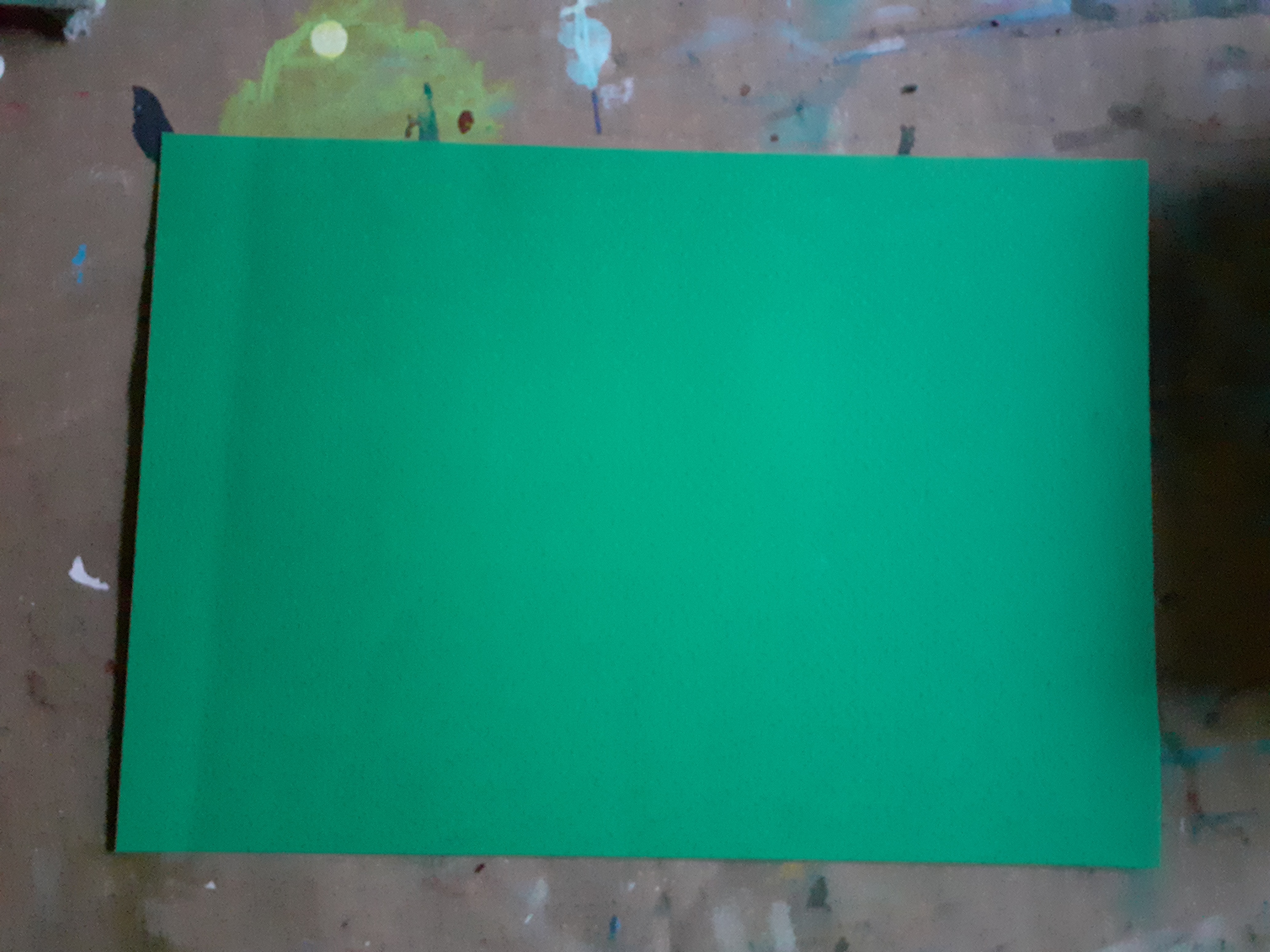
This paper is available in various colours and I chose a green (Prato). The paper is said to contain 40% cotton and weighs 160 grams.
As the sheet was creased, I decided to cut it into smaller pieces, and as I’m not very good at cutting straight, I also used a paper cutter.
Minus: I find the creases in the paper annoying, and they can’t be smoothed out with or covered by the chalk.
The texture of the paper isn’t particularly pronounced either. The chalk doesn’t absorb into it, so I constantly have to brush the chalk off the paper, which is a bit of a nuisance. I also can’t apply nearly as many layers of chalk as I can on the much cheaper Bamboo paper (available at Action), even though that paper isn’t coloured it is a better choice if it comes to me.
Bruynzeel: And then there are the pastel pencils. An expensive box. I tried them out on this paper straight away. Sketching works fine, but once you’ve painted with Rembrandt soft pastels, you can’t add anything else with these pencils. I find this a major drawback (although you can, of course, add details with chalk as well, provided the chalk cooperates).
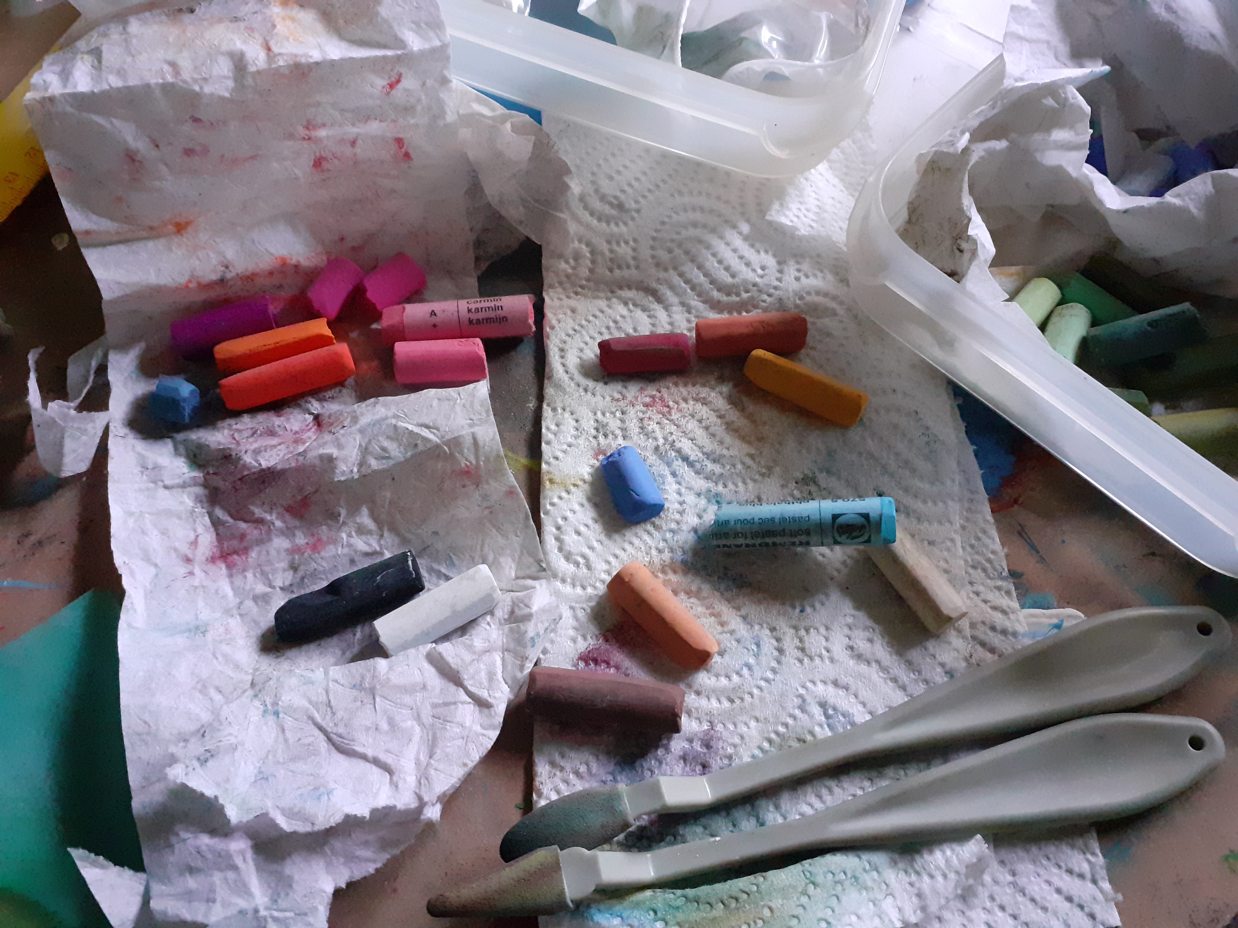
As I travel a lot, I’ve split the Rembrandt pastel chalk in two. I keep it here in a small meat plastic box. The gloves and a few other essentials fit in here nicely too.
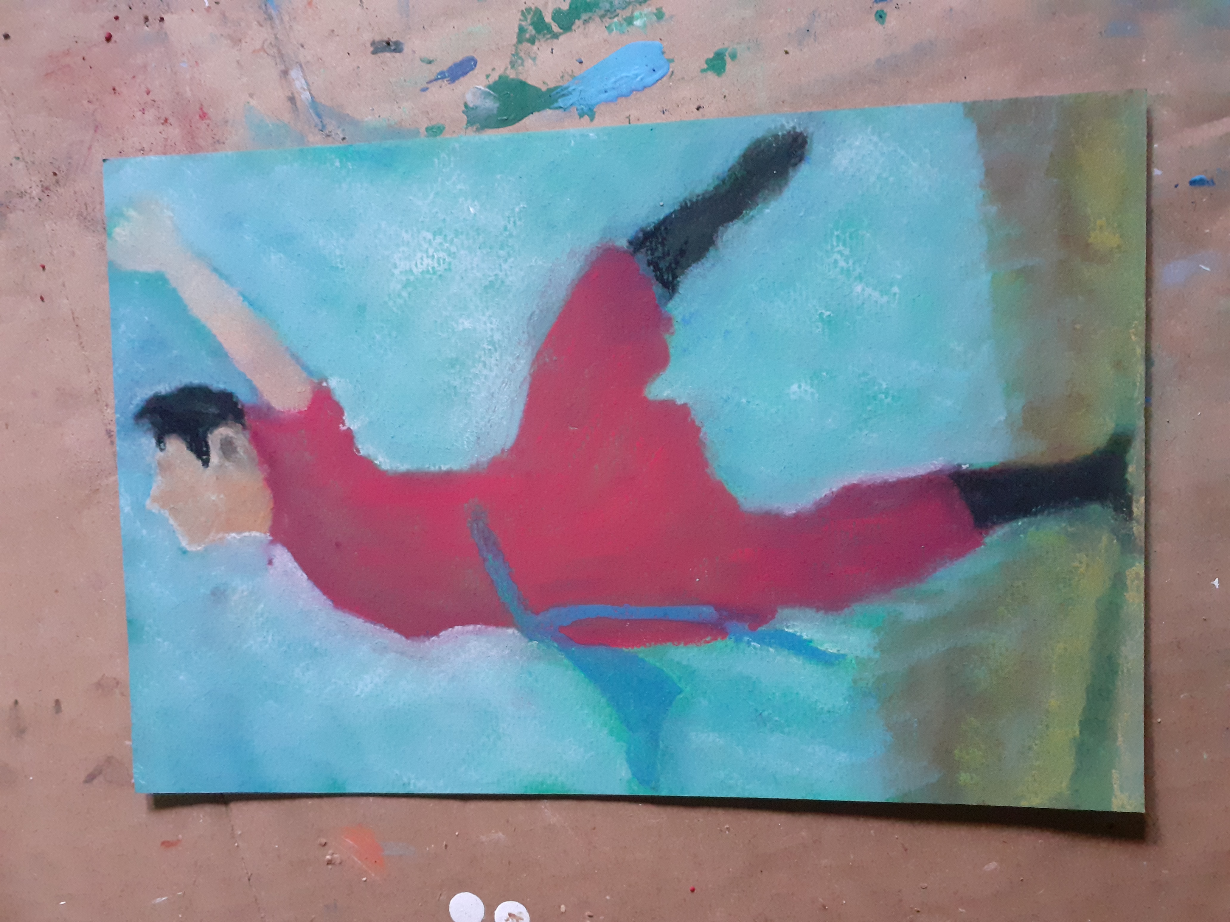
Yesterday I tried my hand at a still life, two pears, also on that green paper. If you look closely, you can see that the paper is still visible even after at least four layers, and don’t even ask how much chalk I had to knock off. I’m going to see if I can manage with much less chalk, as this feels a bit like a waste. Perhaps this paper is best suited to those who work exclusively with pastel pencils.
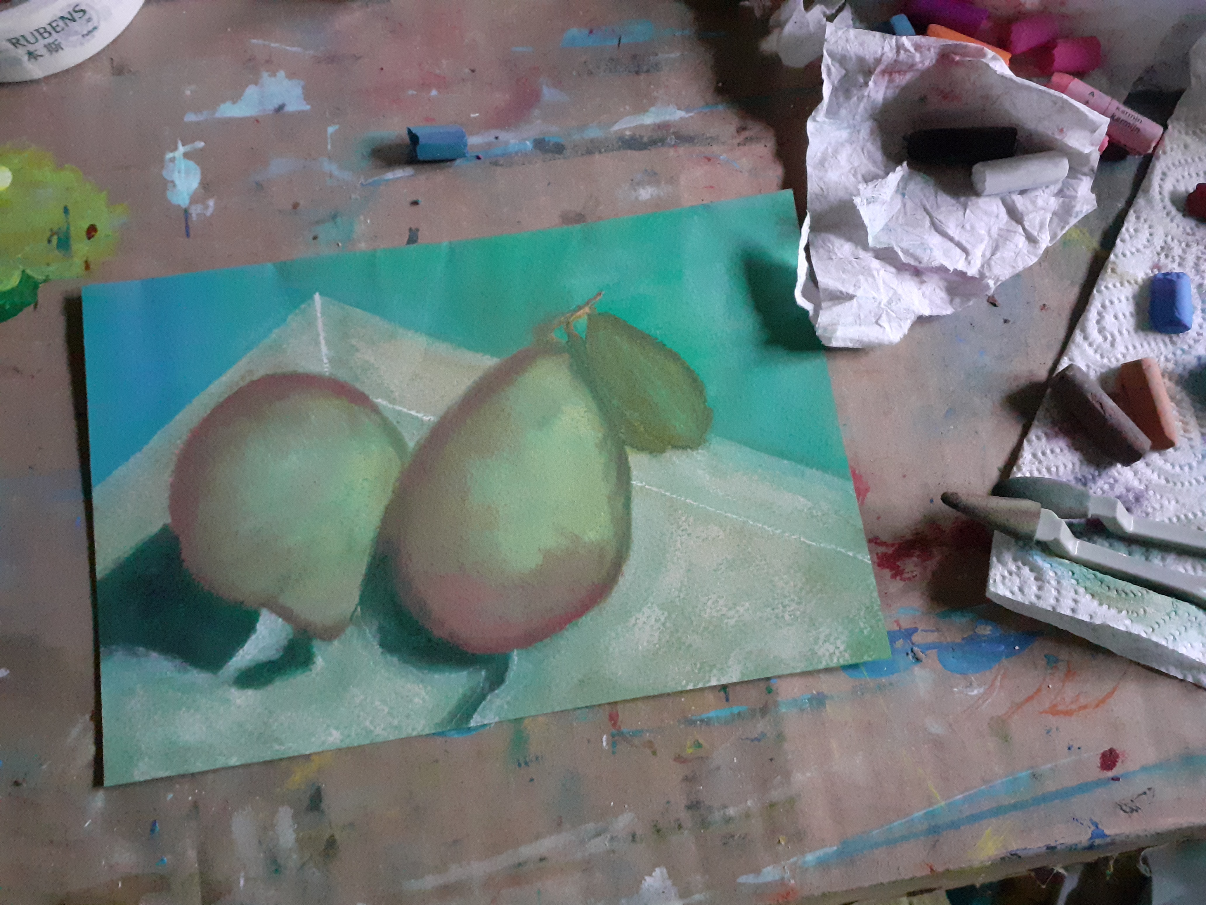
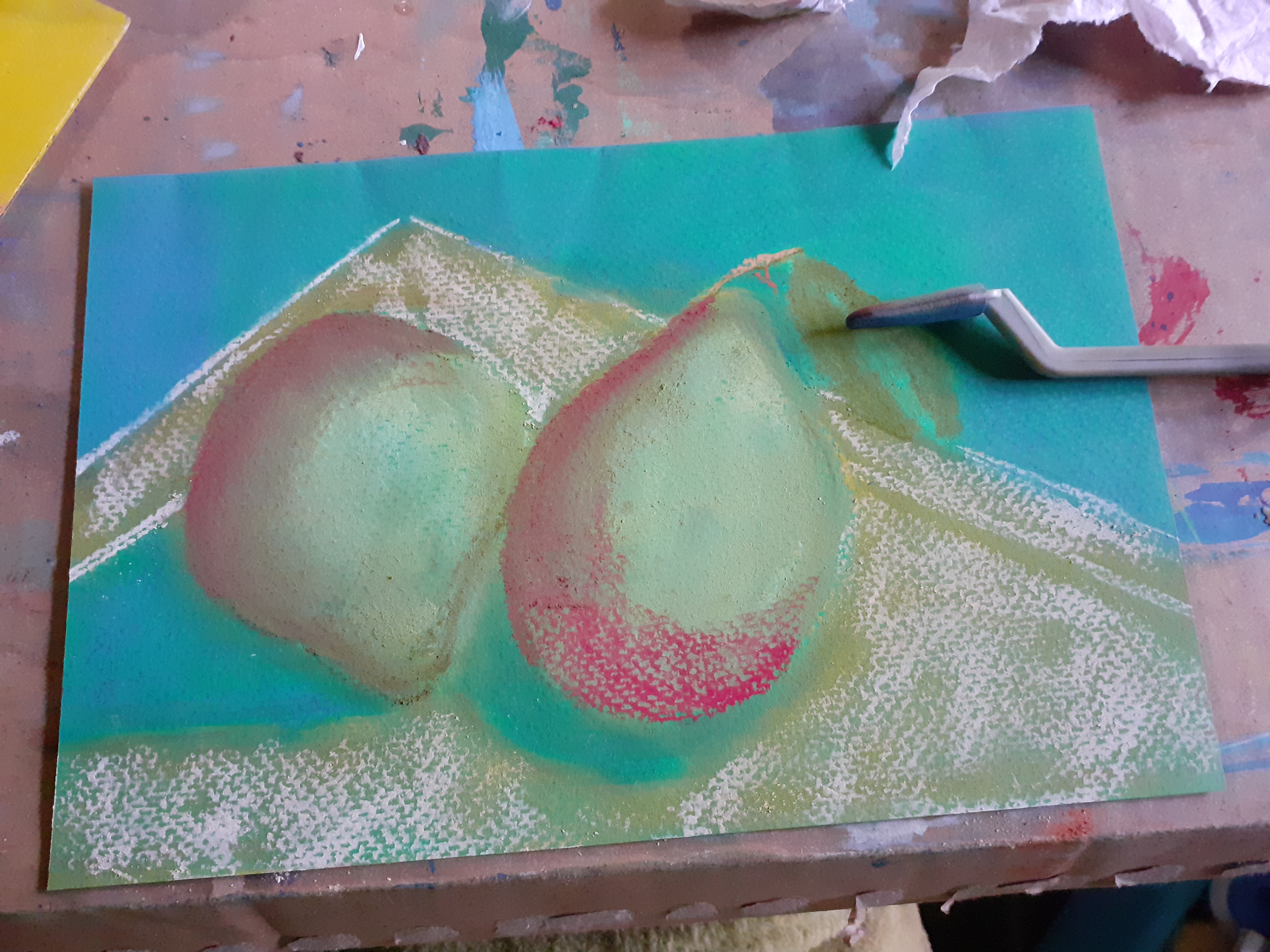
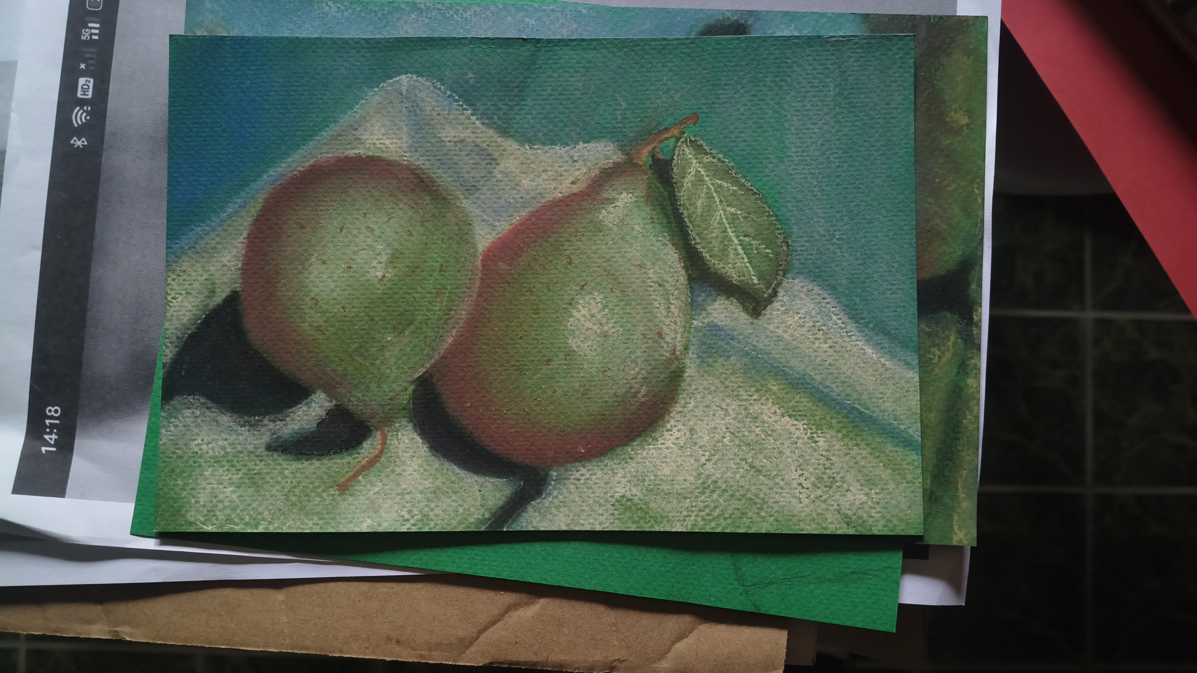
Btw, that still life isn’t finished yet and I can’t tell you which colours I used either, because the labels have been removed from the crayons. In any case, I needed a lot of white and didn’t need any green paper to paint this at all. Incidentally, the green I received is also a completely different shade from the one listed on the Gerstaecker website.
27-4-2026
The wrinkles on such a large sheet are a serious problem, it is completely understandable that this spoils the whole experience from the very beginning. And as for the difference in color, this is also quite annoying, especially when you rely on a specific tone for your composition. I would be interested to hear if you will find a more suitable application for it over time or if you will give it up completely :)
Thanks @sduttaskitchen
For now I will continue to paint on it since I wouldn't know for what else to use it. Let's say drafts. I contacted the teacher and according to her the paper is wrong. I should have a pack of the same brand with different colours. Need to search for it.
I made one today, pastel pencils included, but it isn't getting any better. Tomorrow I try a portrait not sure if it will be with the crayons or just the pencils.
Since the paper isn't nice a passepartout is also not in it. I doubt if it is good for acrylic paint. But who knows.
I think it's a good idea to use the draft paper instead of throwing it away. Otherwise, it's great that you're experimenting with different techniques. Try the portrait again without too many expectations, sometimes that's how the best things turn out :)
I can finally look at photographs. I have trouble understanding images in texts almost every day.
The lack of visual elements makes it significantly more difficult to understand the text, especially when they play a significant role in the content.
Although the still lifes are still a work in progress, the pears already look absolutely stunning! I'm not an artist, but I can imagine how much patience and effort it takes to draw something like this with chalk.
I also really like the color green. It's a shame you can't smooth out the wrinkles in the paper. Apparently, the cotton fiber in the composition makes the paper heat-resistant.
I am afraid that if I would iron this paper it's even worse to paint with the crayons on it.
By now the pears are finished or at least I decided they are and I made the seam tomorrow I try a portrait. Plenty of this paper left and I refuse to throw it away.
I am sorry to hear you have issues with the photos. I know how this feels. I have had it frequently during those years I am on Steemit. Let's hope the issues with the platform are solved by now.
Thanks for stopping by. Let's see what more I can create on green.
❤️🍀
You like the color green, it's a constant in your paintings. My favorite color is blue.
If it comes to it you most likely see more blue than green in my paintings. I like greenore but green is also partly blue and some blues are green 😉
You're absolutely right, there are different shades.
I haven’t used this kind of paper before but I definitely like what I see on it, do you also blend the chalk with your fingers? The first drawing really caught my attention but then again I still love how you shaded the English pear 🍐 one of my favorite fruit.
The first layer I softly rubbed in with the sponge tool, making small circles; it should work to fill the space between the "bumps" in the paper. The next layer is finger rub work, but at first, I only did it with my fingers and used bamboo paper.
I tried a portrait @aellly once drew, started today but it's still a no ..
Here I made some corrections
This is about two thin layers and the face three. Let's see where this ends.
Btw because this is a test I made a sketch with an ordinary pencil instead of a pastel pencil. Eyebrows are still pencil same for the eyes, I do the latter. I didn't rub the white yet.
Long time ago I ate pears...
请问你是在画这张吗?我觉得你很像是在画这张图片。别灰心。坚持画画。总有一天你会很成功的。
另外我很喜欢你这张图片。非常完美。
那你拿梨子吧,我选那个女孩。我用和你一样的照片。谢谢你的回复。
I really love this medium and style of yours can you focus on this pattern for your portraiture? And one honest thing is avoid applying too much white for your highlights it can make your subjects face look flat, its a very impressive work I must confess.
It is by far not finished. I still need to rub out the white. Well, you know how it works...always something else pops up which I want to try out .
You already saw what I did with plaster and there is more unfinished work... 🤐
I don't know anything about this but what is the purpose of a pastel paper? For the texture? I'm seeing the texture in the pear piece. It's very nice. Coz I was looking at Monet dreamy and hazy work earlier, the first thing came to my mind was maybe that kind of art will look nice with this paper. Just my thought. Also why does it comes in green? Not white?
This paper and also the one more looking like sandpaper, comes in different colours. It is to make for example the colour white and yellow visible. I assume that the reason the paper is coloured also lays in the fact there will always some pieces of paper be visible. The colour could help in this way lift the painting.
Why this structure of paper? To hold the pastel (crayons) better, to avoid all the dust the crayons produce, to be able to add more layers (different tricks are used to also make this possible with normal paper like spraying with fixation or hairspray after each layer, working with thinner layers is also an option).
Can be that if one works with this paper, little parts should be showed for a special effect. I don't know yet.
I just checked the watercolour paper (190 he) pad and acrylic paper pad I received as a gift. Even the water colour paper has more structure, the acrylic (300 gr) way more. It can be noticed + felt.
☝️
The upper white is meant for acrylic, the one at the bottom is for watercolour paint.
👆
And here you have at the bottom bamboo paper. It is way cheaper and 250 grams which means also thicker then the green, which is 160 gr.
As you can see it will be hard to use white on white paper. If it comes to watercolour they would leave the white spots unpainted! So white is the colour of the paper. I can do the same with soft pastels and once finished always paints those spots that are left unpainted, or exhange the white for a different colour or use white in the last layer.
🍀❤️
This makes so much sense! I remember painting white-on-white being so difficult—you have to tilt the paper at every angle just to find the missing spots. Even painting a wall white is a challenge because there are always those tiny spots that stay unpainted and you can't see them until the light hits just right!
I’ve seen videos where people layer crayons until they’re perfectly smooth; does using this textured paper mean you don't have to layer as much to get that effect? Also, I actually have a can of fixative spray I bought for a sticker project I gave up on.