The Silent Salesperson: Understanding the Psychology of Color in Branding
In the competitive world of marketing, your brand’s first impression often happens in a split second. Before a customer even reads your tagline or understands your product, they have already formed an emotional response—and that response is largely driven by color.
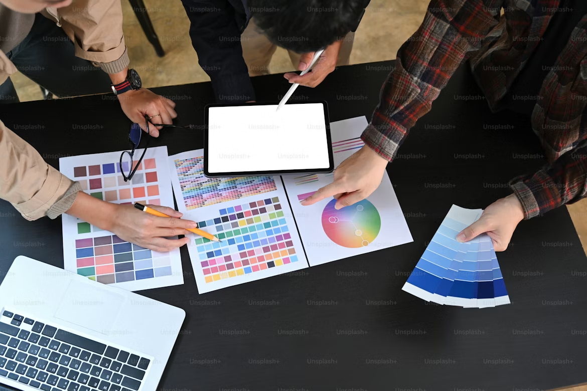
The psychology of color is not just an aesthetic choice; it is a strategic tool. Research suggests that up to 90% of snap judgments made about products are based on color alone. Why? Because colors communicate complex messages instantly, tapping into our subconscious associations and cultural conditioning.
Different hues trigger specific psychological responses. Understanding these can help you align your visual identity with your brand’s mission:
- Blue: The king of corporate trust. It signifies reliability, intelligence, and calm. This is why you see it so frequently in banking, technology, and healthcare—industries where security is paramount.
- Red: The color of urgency and passion. It stimulates physical responses, increases heart rate, and creates a sense of "act now." Brands like Coca-Cola and Netflix use it to drive excitement and bold action.
*Green: Synonymous with health, tranquility, and growth. It is the go-to for eco-friendly brands and those looking to evoke a sense of balance. - Yellow: Radiates optimism and clarity. While it’s great for grabbing attention, it must be used sparingly, as too much can cause eye strain or appear overly aggressive.
- Black/White: The hallmark of luxury and minimalism. High-end brands often use these to convey sophistication, exclusivity, and timelessness.
Context is Key
While these general associations exist, the "right" color is ultimately context-dependent. A color that works for a high-energy energy drink may be disastrous for a meditation app.
When choosing your brand palette, don’t just follow trends—consider your target demographic, the emotions you want to elicit, and the specific action you want your customers to take.
Remember: Color is the silent salesperson that speaks louder than words. Choose wisely, and you’ll create a brand that doesn't just get seen—it gets felt.