KingsCrown Logo Design
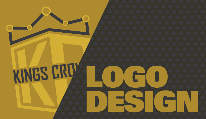
I was asked from @kingscrown to make a logo. I decided to play with the concepts of power and charts. The crown is shaped like a chart and the initials create a shield-like appearance with strong corners placed right underneath. I decided to go with quite a few variations for the gold and gray colors.
For smaller icons I believe it would be best if the initials dominate the logo. The small letters would bot be readable in small icons such as in chat rooms and steemit.

Looks awesome! Especially the one all in black with Kings Crown written across the middle
Your concept of the logo as you described "I decided to play with the concepts of power and charts. The crown is shaped like a chart and the initials create a shield-like appearance with strong corners placed right underneath." is great and all the logos are perfect as per your details. You did a great work @kyriacos
I love the designs!
That's hot! Both the logo and the concept.
I like how understated but visible the "charts" part of the "power and charts" concept is. I had scrolled down impatiently to see the whole logo first, before scrolling back up to read the posting, on my phone, and I immediately thought of a subway map when I saw the crown, but didn't know why at first.
Brilliantly done man.
:)
Outstanding design concepts. Thank you for sharing.
thank you for commenting man
You're welcome.
Very well done!
Awesome work! All the logos look professionally done.
Original clean logo!
yeap!
Nailed it. But this is crypto... Add some flash crashes into the top of the crown ;)
lol. nice one. but it might end up looking too spiky.
Thank you for sharing the logo