My Diary Day 2: How My Day Went - From Paper Sketch to a Logo
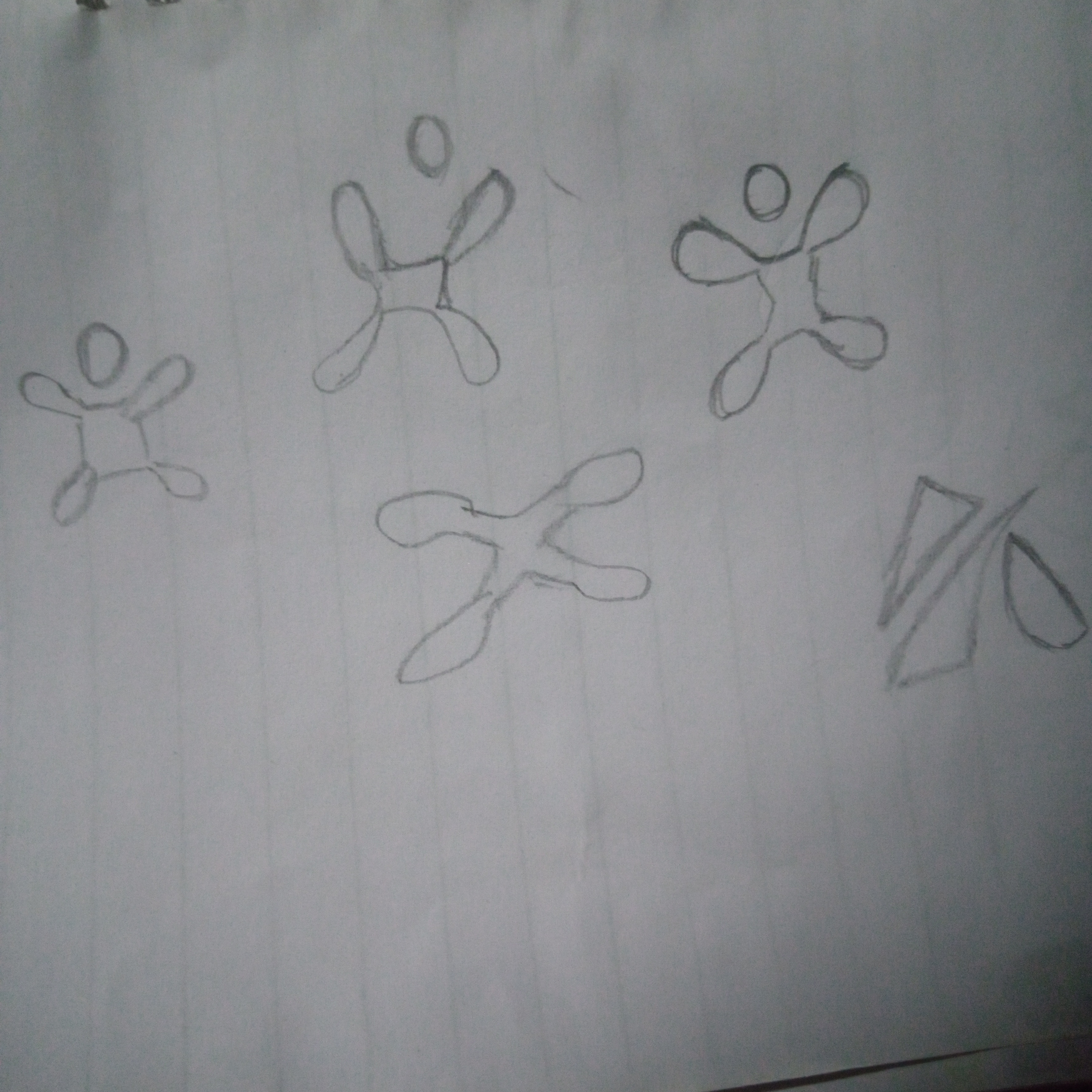 Rough Logo Sketch
Hello everyone, welcome to my day 2 diary, This is how my today went, I was just scrolling through my smartphone and a thought came through my mind and say instead why don't I continue improving my skill and become best at what I do.
I took my book and pencil and started sketching, though every logo starts messy.
CONCEPT SKETCHING
I started the rough sketching in my notebook, no ruler, no pressure, just raw shapes and wordmarks to explore directions. The goal was to get 3-4 loose concepts down fast, after 20 minutes, one idea stood out, clean, minimal, but with a subtle nod to the brand’s niche.
STEP 2: LOGO ON CANVAS
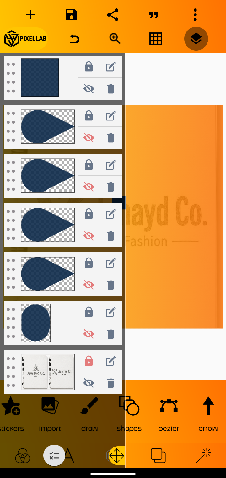 Logo inside Canvas
I imported the sketch into my canvas app. Used it as a low-opacity layer to trace the core structure, this is where it get fixed, first I focused on balance, negative space, and making sure it reads well at small sizes.
STEP 3: REFINEMENT
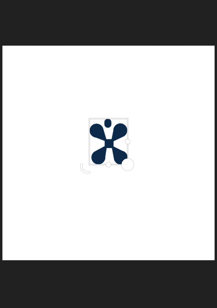
Logo Icon
Adjusted kerning on the logotype, tested it in black and white, and checked contrast. A good logo has to work in one color before it gets color.
OUTPUT

Still a work in progress, but it’s at the feedback stage. For designers here, how’s the balance and scalability? Would you tweak the weight or simplify further? Drop your critique below.
That would help alot.
This is why I love process, start rough, refine smart, deliver clean.