🔥 Crimson Still Life: Where Silence Speaks in Color and Texture
In a world that constantly rushes forward, there are rare moments when stillness becomes louder than noise. This composition captures exactly that — a bold, almost theatrical still life arrangement where color, contrast, and symbolism converge into a single visual narrative. The deep, commanding red objects paired with delicate natural elements create a dialogue between strength and fragility, permanence and transience.
This is not just a photograph — it is an atmosphere, a mood, a story waiting to unfold.
📸 The Composition: A Visual Breakdown
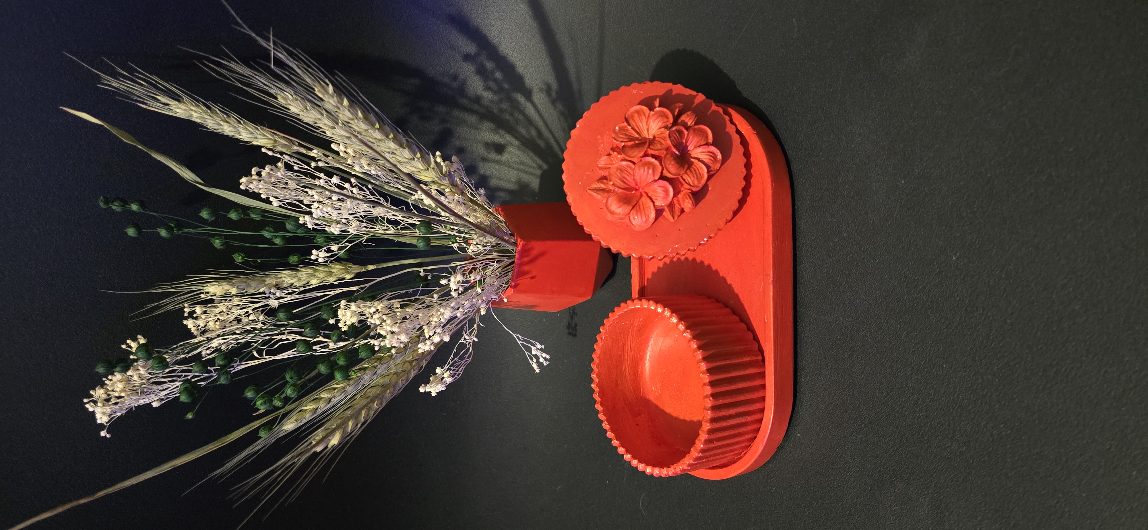
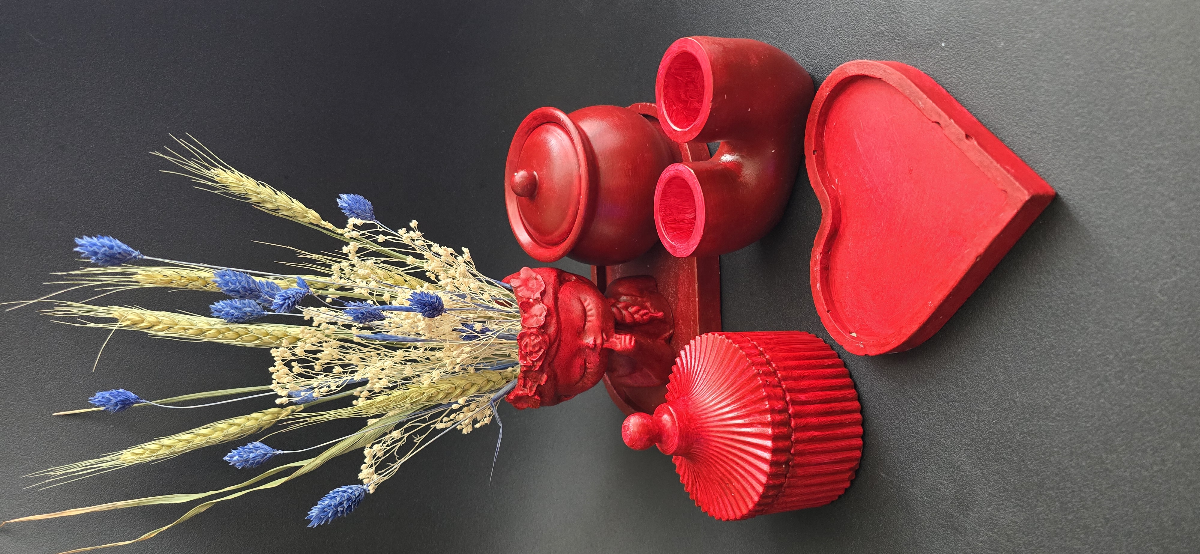
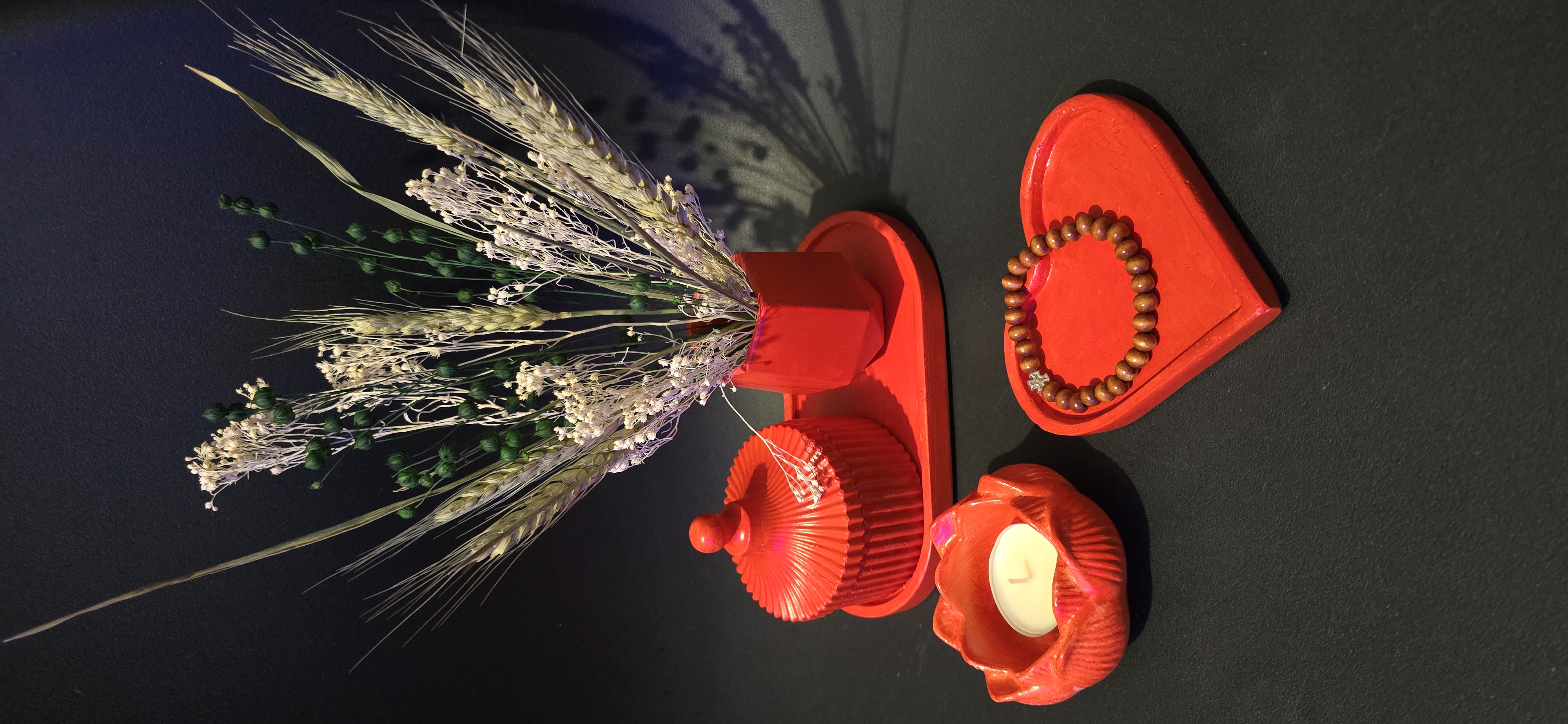
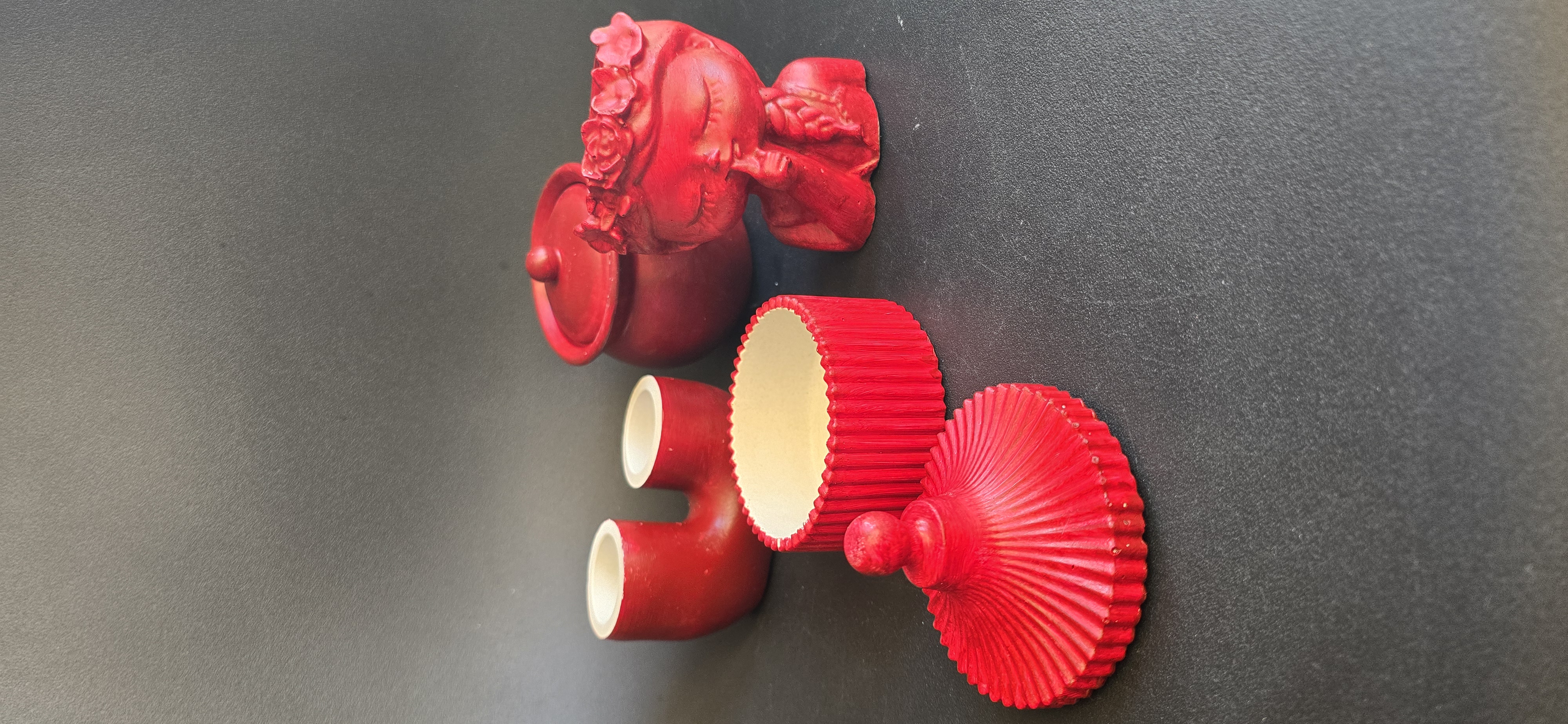
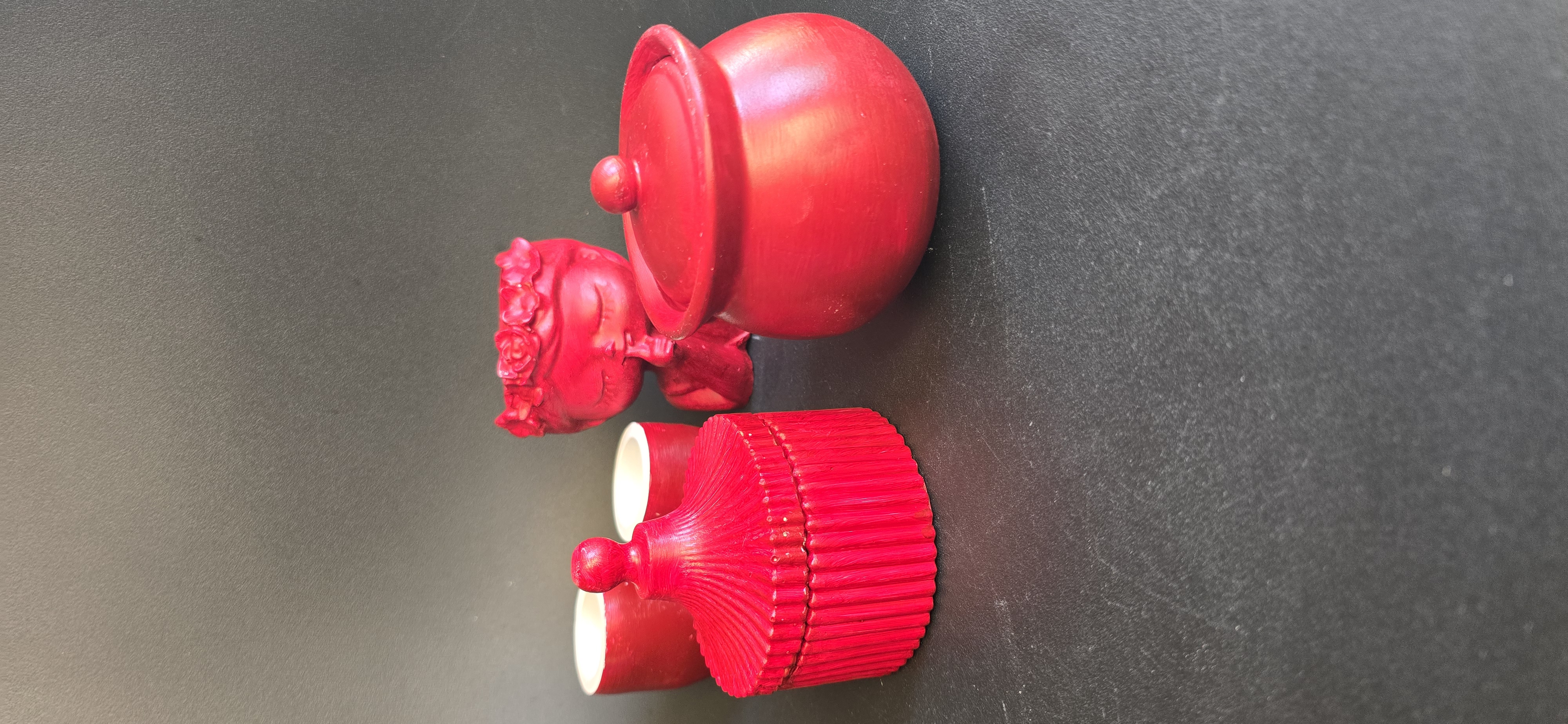
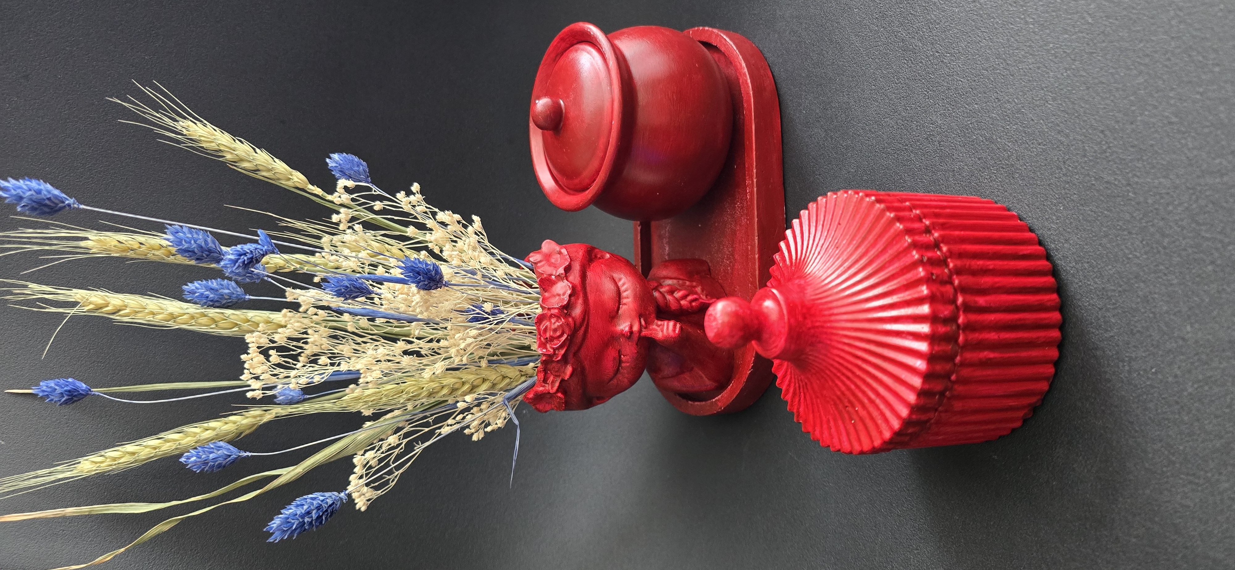
At the heart of the image lies a carefully curated arrangement of objects, dominated by intense red tones. The choice of background — a matte, dark surface — is deliberate. It eliminates distractions and amplifies the vibrancy of the foreground elements.
The composition is anchored by:
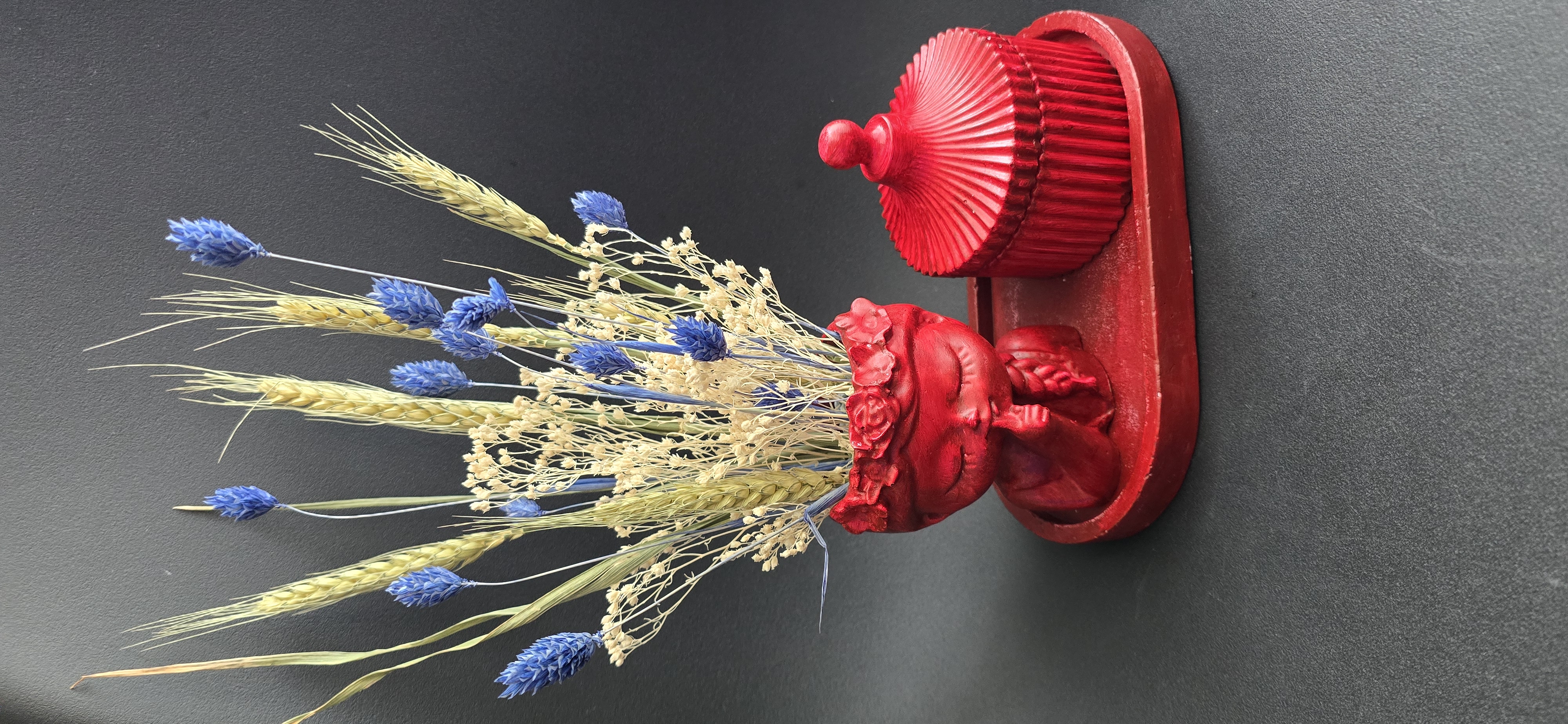
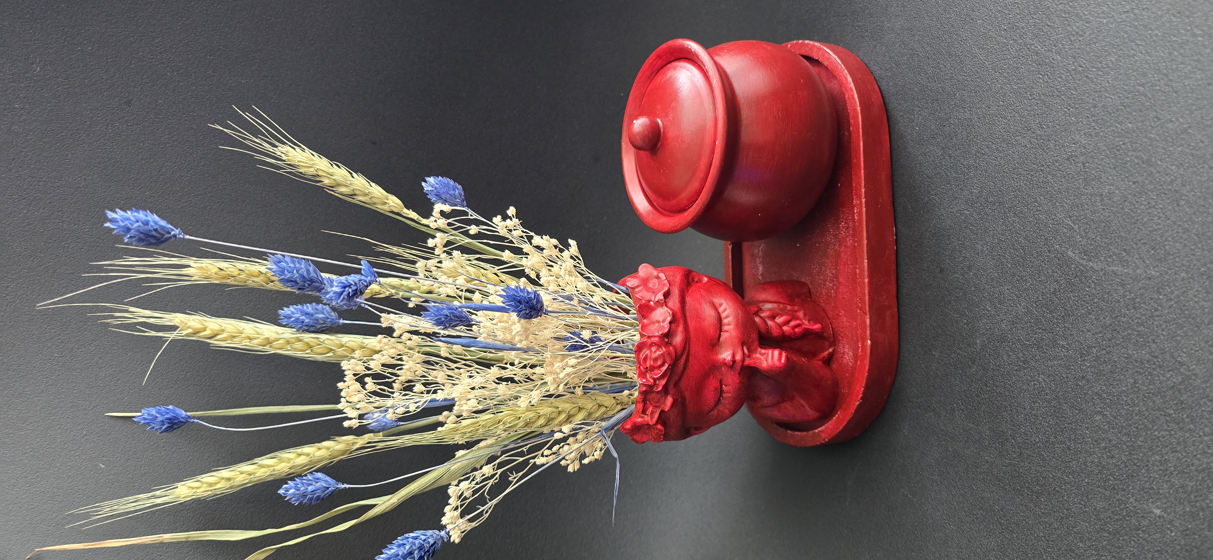
A sculptural vase featuring a serene, almost meditative face
A bouquet of dried wheat and delicate blue flowers
A set of handcrafted red containers and trays
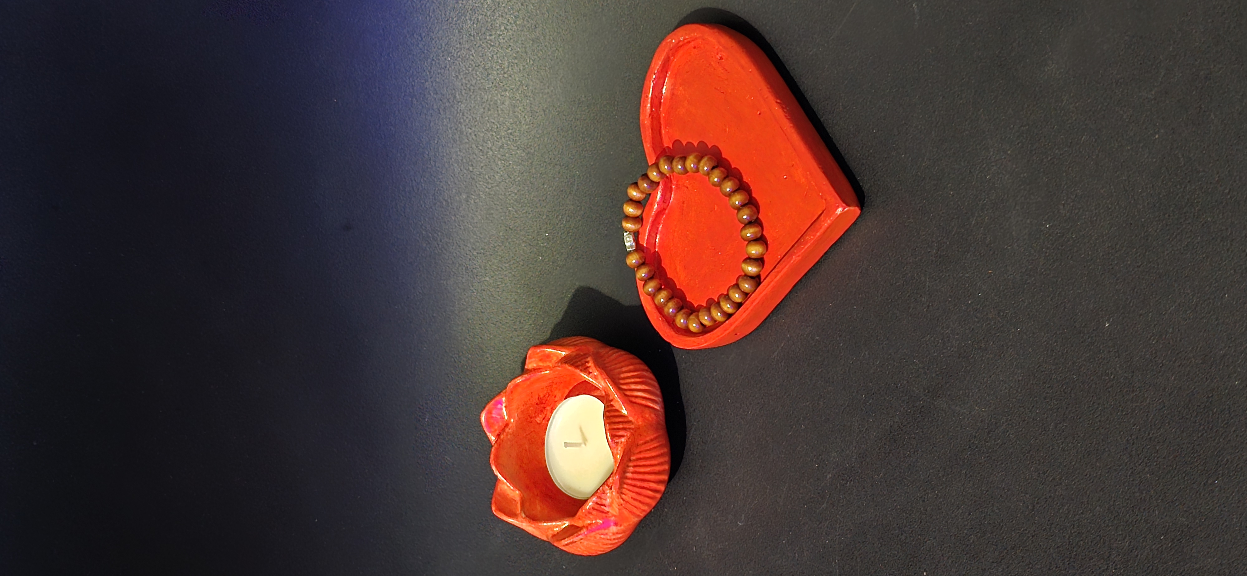
A heart-shaped dish subtly placed in the foreground
Each object contributes to the overall balance, forming a triangular visual flow that guides the viewer’s eye naturally across the frame.
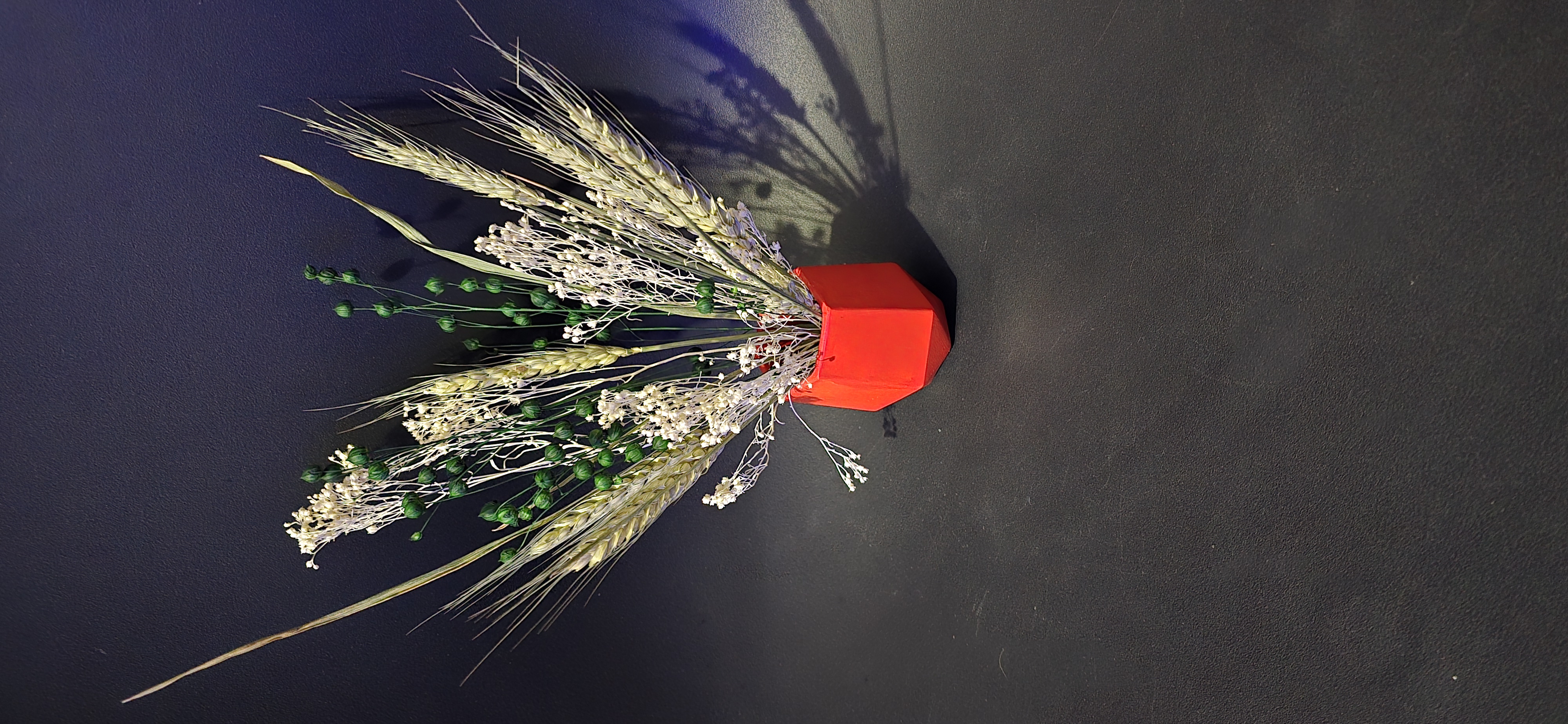
🌾 The Floral Element: Fragility Meets Structure
The dried arrangement is more than decorative — it is symbolic.
The wheat stalks represent:
Growth
Sustenance
The passage of time
Meanwhile, the small blue flowers introduce contrast — both visually and emotionally. Blue, often associated with calmness and introspection, softens the intensity of the surrounding red tones.
Together, they create a layered narrative:
Life (growth of wheat)
Stillness (dried state)
Memory (preserved beauty)
This interplay subtly reminds us that beauty does not fade — it evolves.
🔴 The Power of Red: Emotion in Its Purest Form
Red dominates the scene unapologetically.
It symbolizes:
Passion
Strength
Love
Energy
But here, red is not chaotic — it is controlled. The matte finish of the objects prevents the color from becoming overwhelming. Instead, it feels grounded, almost ceremonial.
Each item carries its own presence:
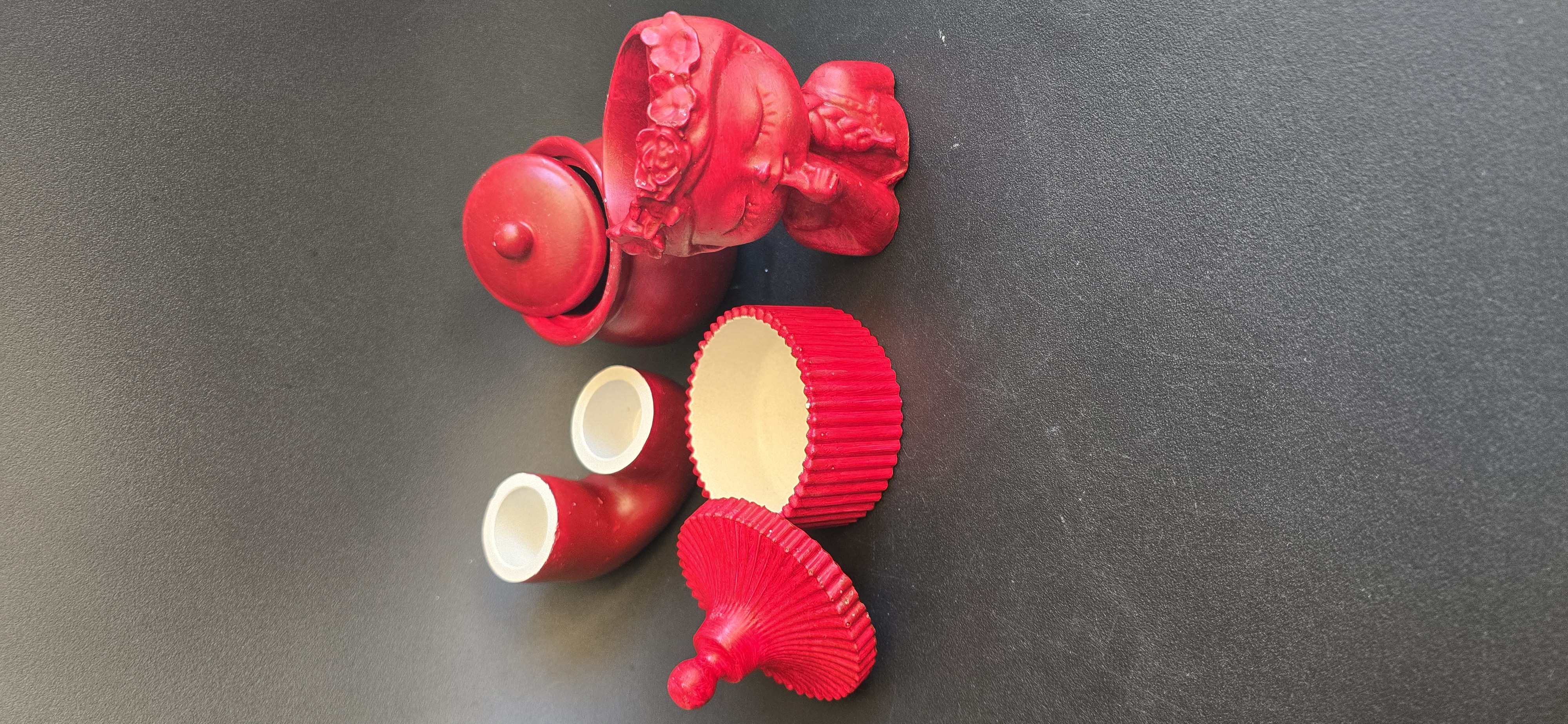
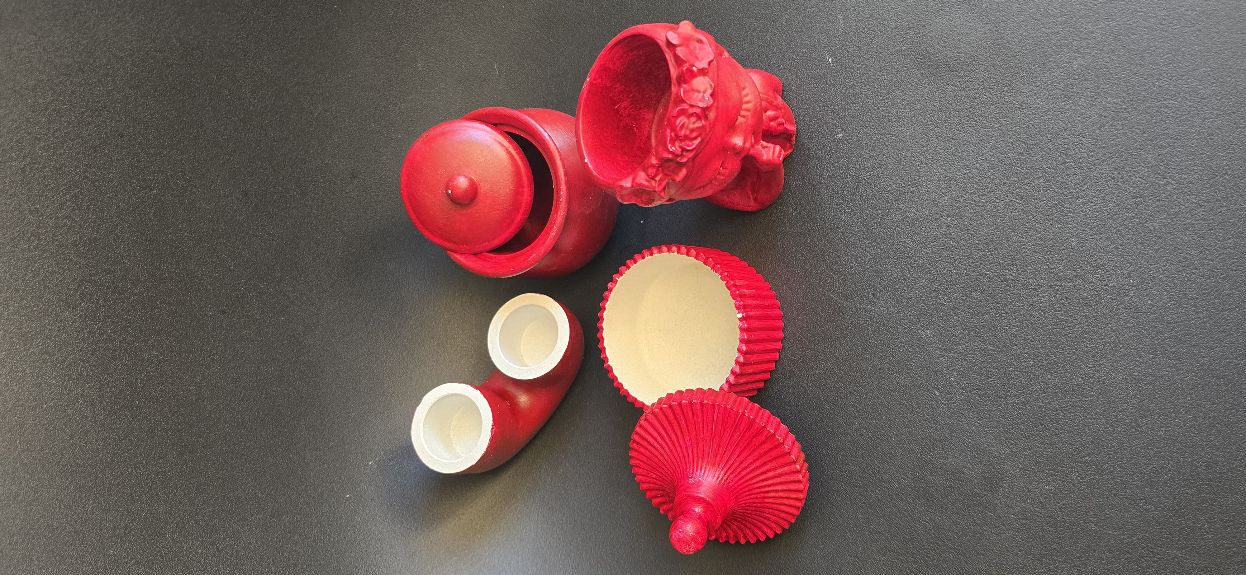
The round container with a lid suggests mystery — something hidden, something personal
The ribbed box adds texture and rhythm
The dual-cup form introduces curiosity and unconventional design
The heart-shaped tray brings emotional context, subtly tying everything together
Red, in this composition, becomes more than a color — it becomes a language.
🎭 The Central Figure: A Silent Observer
The vase with the sculpted face is arguably the soul of the image.
Its closed eyes evoke:
Peace
Reflection
Inner stillness
It feels as if the figure is not just holding the flowers — but guarding them, protecting a memory or a moment in time.
There is something deeply human about this object. It transforms the still life into something almost alive — a presence rather than just an arrangement.
⚖️ Balance and Harmony
Despite the intensity of the colors, the image remains balanced.
This is achieved through:
Contrast: Red vs. blue vs. neutral tones
Texture: Smooth ceramic vs. rough dried plants
Shape variety: Rounded forms vs. vertical lines
Negative space: The dark background allows breathing room
Nothing feels accidental. Every element is placed with intention, creating harmony without uniformity.
🖤 Background: The Silent Amplifier
The dark background plays a crucial role.
It:
Enhances color saturation
Creates depth
Focuses attention on the subject
Without it, the composition would lose its dramatic impact. It acts like a stage — allowing the objects to perform.
💡 Artistic Interpretation
This image can be interpreted in multiple ways, depending on the viewer’s perspective:
- A Meditation on Time
The dried flowers and handcrafted objects suggest permanence versus decay — what remains and what fades.
- A Study of Emotion
The red elements dominate like intense feelings, while the blue flowers calm the visual tension.
- A Dialogue Between Nature and Craft
Organic forms meet human-made objects, highlighting the relationship between creation and control.
📷 Technical Insight
From a photographic standpoint, several choices elevate this image:
Lighting: Soft and diffused, avoiding harsh shadows
Color grading: Rich reds without oversaturation
Depth of field: Sharp focus across all objects for clarity
Framing: Centered yet dynamic composition
These decisions ensure that the viewer experiences the image as intended — immersive and impactful.
✨ Why This Image Stands Out
In a digital space flooded with visuals, what makes this piece unique is its intentional simplicity paired with emotional depth.
It doesn’t rely on complexity — it relies on:
Contrast
Symbolism
Composition
It invites the viewer to pause — and in today’s fast-paced world, that is powerful.
🔚 Conclusion
This still life is more than an arrangement of objects — it is a quiet statement about presence, emotion, and the beauty of contrast.
The bold red tones demand attention, while the delicate floral elements whisper subtle truths about time and fragility. Together, they create a balanced tension that keeps the viewer engaged.
Art does not always need movement to feel alive.
Sometimes, stillness is enough.