Various Designs For Steemit Initiatives
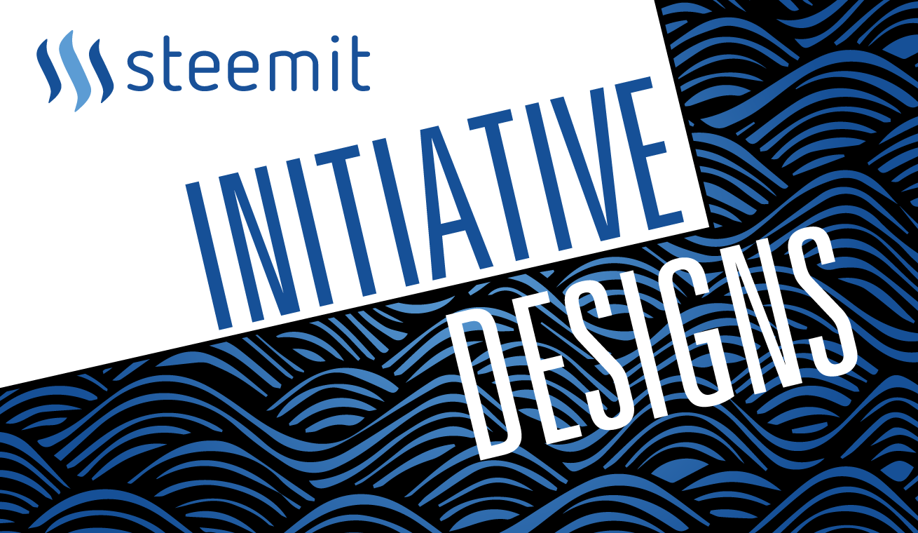
I have been making some designs for Initiatives within the Steemit Platform. I felt it was a bit too much to share them in individual posts so here is some of them clumped together. You can click on each banner to get more info.


Well done :) however i feel that the Colours are muted a bit. I understand that the steemit logo colours are those you used, but why not add a bit of pop to the designs with a little more colour selection. On the designs of Whaleshares and Steemsports mostly.... the others are good. Resteem
I purposely designed them with that color scheme so they won't be too flashy. Some of them are presented together and I didn't want one to antagonize the other.
Some people like less saturated colors while others tend to love more vibrant colors in their photos and logos but you kept everything in between and that is a great job you did with those logos @kyriacos
yeap. It is really a matter of taste. I prefer toned down colors since I believe people's eyes have been desensitized.
dojo is cool
Good job. these designs are very nice. keep it up
Hi 👋🏼 friend! You have a very interesting page, I will follow it and recommend it to others! Rate my first post please!
very nice designs! good job mate
glad you like them man.
thank you
design for 'Shitcoin Arb' kind of reminds me of this game for NES from back in the day Karate Kid kind of idk why!
yeap. that was the idea of the concept. I pretty much designed exactly what the guy told me.
well you've hit exactly what he wanted if it was the first thing that my memory brought me to when I saw it!!, great job!
:)
Interesting designs. Like the first one. Witty and pleasantly cute at the same time. Maybe I too, need a design banner. So cool and eye catching. Leaves an imprint message .
maybe you do! hit me up on steemitchat if you want
I think the gray background in steemsports looks a little washed out. What about a grass-green?
It's a matter of taste really
I agree, I was offering an opinion, not a criticism.
but but..
I love criticism
Sorry, but I back off when I see people offer "constructive" criticism that's really just an attempt to tear down someone else's work and I can only guess the amount of work that went into each and every one of those.
I just think that green makes people think of grass, i.e. baseball diamonds, soccer & cricket pitches, croquet in the garden.
Lambeau Field
In design school you get used to it really.
That's very gracious of you to say.
In 25+ years in the US auto industry it always pissed me off when people who didn't know what they were talking about criticized a design. ;-)
Then again, I guess it takes truly visionary people to come up with ideas for others to translate into real world products.
i kinda developed a tough skin for these things. who cares about what others think really.
Awesome design..resteem